 Although quite short and not much of a game, I just could not pass up posting a quick entry highlighting this exceptional effort that won the grand jury prize for best multimedia design in Rockstar's Upload4 online digital media competition.
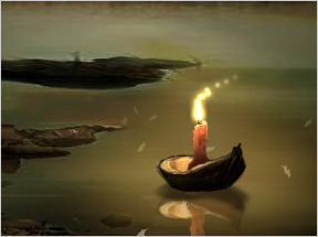
Somnium Orbis is "an exploration of alternative means to progress through a surreal, otherworldly scene." In other words, you must figure out how to progress through each scene of the piece. The gorgeous and mesmerizing (and only slightly disturbing) work of art was created by Nate Horstmann and Peter Schmalfeldt.
(Remember, I said it was short, so no complaining about length(!) Enjoy it for what it is. ;)
Cheers to Garret for the link. =)


This one looks very interesting........
Wow...can't wait for more...the art is fantastic.
I'm not sure exactly how to start.
I just have to complain about the length. :) I finished it in like 30 secs :P Anyways, good stuff. The first part was really nice. The two scenes looked pretty different so Im guessing one guy did the first, the other did the second?
The first part was a bit dificult to figure out with a lap top.
It was dificult to get the cursor moving fast enough to even notice that it effected the wind, much less get enough wind to blow out the candle.
That was amazing, took me a few second to beat, but wow. The first level was exceptional and the second was entertaing and a bit creepy. Wow is all I can really say... I would love to see more.
Where did you (or, how) find this?
I suggested it. I got the link from a friend! Thanks alot for posting this Jay! It's a dream come true, to have one of my suggestions on JayisGames! haha. Yeah I set my standards low ;-)
Garret, great work! This is a fantastic find!
Thanks!
very umm.....intresting
though i dont understand the second part...it ends even if i dont do anything
anyone know how to get the pic. for the first one? it's so nice... could use it for desktop background. etc.
Press print screen to take a screen shot, then just use paint or somesuch tool to seperate it.
Wow that was creepy!
No offense, but that sucked. I know you said it was short, but I had no idea that if I blinked it would be over. Keep up the good work Jay. I love your site, but did not care for Somnium Orbis.
the issue i have isn't the length, but rather the fact that it can be "beaten" without any skill, effort, or really, any brain power at all. for the first level, i didn't even realise that
moving the mouse affected the wind, and that that blew out the candle
, i passed the level completely by accident and had no idea why.
not to say that it can't be appreciated for artistic value, but it would've been fun if it were a little more of a challenge :)
People will always find a reason to whine, huh, Jay? :-) I loved it.
Short, but very cool nonetheless. I hope these guys extend it sometime soon. Nice to have you posting again, Jay!
15 seconds.
Still, the first part was pretty. I hope it gets expanded or something along those lines.
REALLY short. Utterly beautiful though.
Man, you SO rock! I could spend hours here & I just might! I have bookmarked you & blogrolled you,....What an awesome blog you have!!! I'm a mom with need of stress relief a LOT & THIS certainly counts! Cudos!
For the second level, if you want to call it that,
if I clicked enough on some of the creatures, they would eventually be sucked into the glowy center. It took a lot of clicking, and some of the creatures would not even budge. Only after getting a handful of them vaporized did the light get brighter and the game ended.
I don't know if that means I took too long or what. Still confused about that.
Ok, scratch that.
Instead of clicking like a madman on those creatures in the second level, just hold the mouse button down and they should vaporize soon enough. Yet again, however, I was only able to get rid of a handful of them before the level ended. I don't think you are meant to get rid of them all. I figure this because it took a lot less time for the middle of the screen to engulf everything.
To say that this game is "short" is an understatement. It consists of only two scenes, the second of which is pretty pointless. I liked almost everything here, but this left me in a state of "not amused."
well it is short, and creepy without offering real suspension, plus the gorgious art from the first stage didn't make it to the second one, as it was just blurry background light with silhouette in the front.
It also was super laggy, I didn't notice the mouse affected the wind as I tried to propel the leaves.
The amount of things that get affected by the way you move your mouse in the first screen is pretty amazing. The music, the leaves, and the candle all respond to your movements. It was interesting how the author revealed what to do through some very simple visual cues. A must-see for anyone wanting to make a game without a tutorial.
Wow, that was amazing. That is probably one of the coolest things I've ever seen.
And you're right, Jay - it IS short. :) But it was awesome!
I too am wondering if the screens were made by two different people, as they seem very separate from each other. The first one was beautiful though - and I have to admit that I spent two minutes trying to blow the leaves into various locations before I figured out what I was supposed to do.
Very nice and arty. Unfortunately, this really seems to scream (no pun involving slightly demonic and/or weird, ghostly creatures intended) for a backstory. It's rather disappointing that this is all we get, instead, being more a promise of something interesting to come than something interesting in itself. However, it is very nicely done, and for what it is (a 30 second teaser at best), it succeeded at entertaining me for a short bit.
As for the first screen, I had no idea what was going on. I thought I had to get the leaves into the candle. I probably would have ended up in a similar situation to Juju if I hadn't simply given up and looked at the spoilers here. Second screen definitely was at least imagined by someone else, if not drawn by someone else.
wow. two levels. haha it's a little creepy. and i don't know whether to classify this as a point-and-click game or not.
yeah, orion, i tried that originally, and couldn't get it....and then read your comment...yup. i was on a laptop..it took me forever.
i dont think there's need for spoilers in this type of game which is more about enjoying the graphics and the idea of an abstract arty game
I think this is some sort of Viking ceremony, if I remember correctly when a Viking died the fellow Vikings would light a candle, and put in a boat and let it float off to sea. They believed that it was a crossing of the mortal world to the afterlife. This explains the first part, the second part I still don't understand. I think it might be other dead Vikings, but I don't know why they are affected by the light. It might be their dead spirits going to heaven, but then again I am not 100% sure about that second part.
That was fun a little short but lots of fun. Hope to see more soon!
I really liked this one even as short as it was. It was creative and very beautiful. I see this as more participatory art than an actual game. Even so, it was fun and I hope they create more or at least add to this one. Nice find!
I love how the two scenes are polar opposites. In one you blow out the light and to achieve darkness, in the second you get rid of the darkness to revert back to light. It's fascinating.
This isn't a game, why is everyone so mad about the length and the fact that it needs a some sort of back story? Since when did artists need to justify their art?
Er, you don't really have to
click on the monsters repeatedly, just hold the mouse button down when you click on one.
Thanks guys for all this feedback. My friend Nathan and I actually heard about the Rockstar Games Upload contest about 2 weeks before its deadline. So what was uploaded was the best we could get up before that time.
We have actually created a website (http://www.somniumorbis.com) for this project as we do have extensive plans for working on it. We have already recorded the audio for five scenes and have plans to go back and revisit the issues your members have brought up in this message board (since these were complaints we had ourselves).
Thanks again for the positive feedback. Nate and I are trying to find some interesting locations to take some surreal pics for our next scenes and then screw with them some more in Photoshop.
We do hope to make this a little "smarter" as we have already planned several things we could do, but just did not have the time to get them into this contest.
Thanks again for the kind words.
- Peter Schmalfeldt
I was looking at this game (by looking I mean repeatedly going to the second level to click the things and try other stuff) and I'm starting to wonder if there really is only two levels, I dont really have the software to import this into a program and check out my suspisions for certain, but it seems odd that you would be able to pass a level without really doing anything. I'm hypothesizing that maybe when we do the click and hold thing, we're really just game-overing. Any thoughts?
That was very cool. I hope something longer comes out soon!
can anyone describe or take a screenshot of the monster/zombie? is there a scream?
just wanted to make sure... just being precautious.
Neat stuff, Peter. I wondered if there might be more to it; there certainly is potential for more here, and it didn't seem... finished, I suppose. Here's hoping you can get it done soon so we can enjoy the result. :)
this was definately wierd. i wouldn't call it a game, exactly... the artwork was very pretty, and the second level, that was kinda creepy. i love your site, jay. Keep it up!
What????This game was like a dream come true, untill I found out there was 2 level's...then it was a nightmare.....
oook that was........ interesting .Relly intriging but well it would benift so mutch from some sort of multiple ending .Like the small black portal enveloping the screen or sumtin like that .this one with a more satisfing final screen .regardless this has the potential to be something big .something that triggers somthing deep deep down inside us that makes us question every thing .Plus its not that bad on a laptop. just wave the mouse around a bit and there you go X).Relly somthing grats for the award.
well first I tried to make a halo from the leaves around the candle...but it didn't work :) then I went nervous and shaked the mouse to make them flew away... then I realised how to start ;)
I just move my mouse
round and round
and it seems like the breeze getting stronger. at first, I thought I need to click on something to move on.
For the second part, it is a bit creepy, because of the music and those weird looking beasts in the dark. Treat it like a zombie shooting game, click many times on them, I realize the middle ones are more important than the side ones. Strange little orangy bubbles will be seen when 'shooting' process is on, and the beasts will disappear into the so called 'hole'.
You say it's short? You're kidding me..
So Peter.. Any updates yet of any more levels?
I have mixed feelings for this game. I'm sure that if it had more feeling and purpose and was a little...ok, a LOT longer, it could be really great.
awwww it was too short
creepy! O_O
I love it!
Nice art, and interesting concept, but way too short. Can't wait to see the rest. :)
The review was written May of 2006. I'm writing this comment on June of 2008.I played the game, loved it, went to the website mentioned, and the only thing I saw was what Jay has on this site. There wasn't anything else after more than 2 years, and I'm a little disappointed. That means they're either making huge changes and making the game much longer, or they've forgotten about it. But then again, I don't know how long it takes to make a game like this.
On another note, it's pretty obvious that one of them made the first screen , and the other one the second. Does anyone know who made what?
One minute it's this calm, pretty candle screen with nice music, then BAM! It's a zombie shooter! What are they trying to do, give me a heart attack?
... what just happened?
Update