![]()
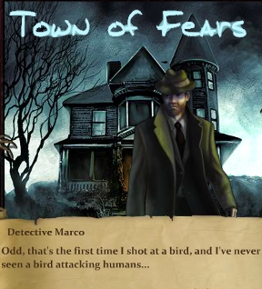
 Detective Marco is having a week full of horror. There's a serial killer on the loose, the professor he wished to consult has run off to the spooky village of Kraig Rock, and there's all these friggin' dire wolves on the prowl. Even as a typically hard-boiled visual novel adventure-RPG protagonist, he'll need all of his skills and the support of a team of Kraig Rock's mysterious inhabitants if he hopes to unravel all the mysteries of the Town of Fears, a release new from MuHa Games.
Generally, Town of Fears is played by reading through the story until an enemy is encountered. You'll choose a member of your party to lead the battle, then enter a quick timed event-based combat screen. After using the mouse to chose an attack or special move, an arrow will travel along a bar at the bottom the screen. Clicking at the right time means more damage. Enough victories grant Ability Points for upgrading stats and attacks. An innovative battle engine wrapped in an somewhat-cliched story, Town of Fears is quite reminiscent of Steve Jackson's Fighting Fantasy book series. Remember those? They were like Choose Your Own Adventures' cooler older sibling where, if you made a bad decision, you'd have to get out the dice and fight a manticore. Yeah, they were great. Anyway, Town of Fears is much more linear, but it definitely retains the sense of unpredictable menace. It also has some really nice portraiture, even if the attack wounds are strangely MS-Painty. Granted, the timing of the combat engine feels slightly off, and the game's prose could've been improved by a spell-check, but Town of Fears length and uniqueness does much to balance its flaws. Fans of Horror RPGs should find its atmosphere effectively eerie.
Update: Some of the problems mentioned are fixed in the latest build that MuHa Games just sent to us, mostly improvements to text and interface responsiveness.


This game was terrific. Well worth a quick play through for fans of turn based or action RPGs. Thanks for the suggestion. :)
It's a very neat game, but in no way is it a "choose your path" novel as there's very little choice story wise. There's 2 bonus battles, but that's it, and I don't think they affect anything save some dialogue. Perhaps they had meant it to be more open ended (as the map somewhat hints), but that is not what it is right now.
The atmosphere and story reminded me a lot of Arkham Horror and Lovecraft fiction in general. Though, the story itself was at times... unfinished? where there were some unique looking characters, that were only the barest filled out before the main ones left them (like the asylum doc or the duelist at the end).
One good thing about using games as an interactive medium is that we can learn more about the chars not just from reading their description/dialogue. We get a strong first impression just from looking at them, and having each character have different design/style in their upgrade page was a nice touch.
Gameplay wise, this was quite well balanced with no one char being useless (remember you can defend to boost con for the librarian allowing him to basically fully heal with his heal skill), though some are definitely stronger than others. Hard was somewhat challenging, with hp management among the chars used being more important by the end. However, this can also lead to dead ends as your chars just don't have enough hp to kill a specific boss or path, esp. as you only have 2 save slots. I would at least allow all chars to fully heal between chapters so that no one will have to fully restart just due to some bad choices.
Bugs: if you reload in the middle of a battle, some things will carry over from the previous battle: reload times and con. boost from defending. If you die while killing your enemy, it still requires another char, who instantly defeats the enemy.
The biggest tip I can think of is to make sure you upgrade attributes.
The one thing I don't understand is that you have to click LONG before the slider reaches the hit zone in order not to miss, but it seems to change from creature to creature. I'd like it if it was a) more consistent or b) actually hit when you click.
Whenever I play a game using the Jay Is Games client, the window frame is too small so I am missing the edges of the game. If I play the same game using Kongregate or Newgrounds or whatever, the window is the right size. This has been an issue for awhile, what gives? I am using Mozilla Firefox with Windows 7.
[It sounds like your browser may be zoomed in. Check our support FAQ about it and how to fix it. -Jay]
Played through "hard," and I have to say it was barely such. Neat game, some issues with gameplay and certainly not an open-ended game in any way, but fun enough that it kept me playing. Although I did find that by the end, my two strongest characters were pretty much invincible and I didn't even "die" once during the final boss.
Wonderful game. Kept me up until 1am. I didn't even notice until I finished it and looked at the clock... -_-*
Update