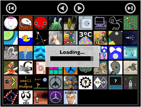
 I took time out from playing and reviewing games today to give the Favorites editor a long overdue update. I switched the underlying technology from DHTML to Flash (8), which made cross-browser support a lot easier on me. Sorry Linux users; you will still have to use the old interface until Flash Player 9 comes out early next year.
Presently the icons are ordered from newest to oldest in terms of when they were featured on this site. There are still some improvements yet I plan to implement to this new interface, such as sorting by Title—and perhaps even genre when I get tags in working order. I would also like to pop up the title of the game when you mouse over the icon, but we'll see how that goes. If there is anything else that you think of that may make using this tool more useful to you, please share them in the comments.
Managing your favorites just got a whole lot easier. Bug reports are always welcome and appreciated. =)
Update: Pop-up game titles have been implemented.
Update #2: Double-click an icon to read a review excerpt.
Update #3: Sort alphabetically or chronologically.
Update #4: Changes are saved automatically.


the title of the game pops up now when i mouse over it....
nice, this makes it so much easier to organise my favorites. I love it!
Oh, yes, you're right Allegra, when you mouse over your favorites on each page, the titles do pop up.
I was referring to in the editor I that I just put up online. The site out grew the old editor as that page is now about 37 miles long with icons and it will often fool Mozilla browsers into thinking that a script has gone unresponsive. =/
Great to see you working so hard on the site. Sadly, due to flash 8+ not being released for linux for like a million years now it means I cannot play half of the games you pick. And darn it, they all look so good :-( Well, I will check the site from time to time, but you may want to rethink the linuxmacpc tags of it's flash 8 :-(
Bah humbug!!
lol Thanks anyway Jay
Hey Jay looks cool, I'm not seeing the names of the games popping up however (using firefox).
Cheers, slgalt! The titles aren't implemented yet, I've only just mentioned that I'd like to add that to what is there already. =)
The interface looks good so far, but without the title pop up I think it will be of very limited usefulness--at least to me, since I cannot recognize most games from the thumbnails. Sorting by genre or tag would be a great bonus, but in my opinion the title pop up has to come first. It is such a key element of the functionality that I was surprised to see the "we'll see how that goes" comment.
I also noticed that nothing happens when you click on a favorite icon. Was this intentional? It would be nice to maybe load up the review page in a separate window so you can read the review if you are not familiar with the game. Also, without the title pop up, being unable to click on an icon to access the review pretty much makes the editor very difficult to use at this point--again, at least to me. As it is, it's pretty much a matter of guessing what sort of game might be hiding behind each icon. Maybe I'm just a more text-oriented person.
I'm not trying to be snarky. I really appreciate the fact that you've gone through all the hard work of putting together an editor. I'll just probably hold off until the functionality is complete before I try to use it.
Keep up the good work!
Thanks, Suho. I'm working on adding the titles now, I just didn't want to promise such a quick turnaround with it before I knew what I was getting into; hence the "see how it goes" comment. =)
I thought it would be useful, even in its current state, so that's why I didn't wait to roll it out. I do appreciate your feedback, as it helps to prioritize what is needed most.
cheers!
It's looking to become a great update, but like what Suho said, an ability to click on an icon to open a new page with the review would make it a lot more convenient. I was thinking that maybe if you click on the icon it'll highlight it, and on the top bar there can be a button to add it to your favorites and another to open its review page in a separate (or same) window.
Jay: Ah, OK. I get it now. No rush, of course.
Yes something that works with IE :)
I agree with Suho... both the mouse-over titles and links to the actual review would be incredibly helpful.
Otherwise, it's a pretty nice interface. :]
Hey Jay,
For some reason I am unable to play any games in the Casual Gameplay Competition or any other game that uses the "fizzlebot" window. Help?
Brett - I have heard a smattering of reports from some others claiming similar problems, and I believe it may have been related to my Apache configuration for those files. I have made a small change, can you try it again? Also, if you click the "Game Competition #1" link in the header menu above, does that work for you? Cheers!
Thanks Jay! Everything seems to be working now
Jay...Nicely done as usual.
Nice interface. I would like to leave some constructive feedback, though.
1) When I originally chose favorites, I forgot that I originally had blocked cookies (by default). As a result, I had to go through again and pick them out again. How I would fix this is having two options: Save, and Save and Return. Save would pop up a window that would (ideally) check your cookies and say "Your changes have been saved!", whereas Save and Return would redirect you to the page that referred you there.
2) Once you have favorites set up, there is no easy way to get back to the HTML version. I don't know if there's any way to check for Flash compatability, but it may make it easier to have a line or so below saying "If the Flash version above doesn't load, use the slower, uglier HTML version" with a link to said version.
3) I also wanted to add a few additional games from a while back. Unfortunately, I didn't remember the exact icons used (though I eventually found them). What I would suggest is providing some method of sorting the games alphabetically, not just chronologically. I understand the rationale for chronological order - it makes it easier for someone to add just the latest game they like - I'm just suggesting that having alphabetical order would be handy also.
4) Also on the subject of icons, I do appreciate the names popping up on the selection list. Would it be possible to provide a 'low graphics' version? How I would do this is have a scroll box listing the games - the actual names, not the icons - and when they are dropped onto the Favorites, then it shows the icon.
None of these are fatal flaws; it's really good looking, and I think it's great. It's just that, well, you've given this mouse a cookie, and I'm asking for a glass of milk.
Thanks!
Thank you! =D
Excellent feedback, Parse, and all very good ideas. I especially like the lo-fi version, and it's totally doable with the code I've got so far. Just a matter of making a usable interface for it, which is the time consuming part.
I am presently working on getting the entry excerpt to pop up with a double-click so you can preview a short blurb about selected games. Once I finish with that, then I do plan to implement sorting by title. Cheers!
Wow, this looks phantastic and is a very creative and innovative feature :)
For me everything worked fine. I would also have made the suggestion of sorting the games by title, but Parse was faster ;)
Thanks for putting your time in this improvement :)
Cheers,
Mystery
Neat feature. Friendly half-baked suggestion: automatically save changes and drop the "Save" button.
Thanks, j. I like that idea. =)
By the way, sorting alphabetically by title, or chonologically (by date) are now implemented.
I never really tried using the Favorites option until just today, but having to choose only 18 titles out of your extensive collection is.. well, appalling. If I could choose more (way more) I might be more inclined to use a Firefox shortcut to your site. Perhaps you could cycle games in the Favorite section the same way Recommended games are cycled. Otherwise, I think I'll just end up making a Jayis folder in my IE favorites and putting the games I like there rather than using your feature.
Yes, but IE doesn't allow you to save the nice little icons with each bookmark like my Favorites feature does. ;)
Any more than 18 and organizing them becomes a task in and of itself.
How would you have them organized to support the number you're interested in saving?
As I said before, cycle through the Favorites the same way that the Recommended games get cycled through, and provide a link to your Favorites list so you can look at all of them. The Recommended section changes every time you visit a new page, so I don't see why you can't do the same thing with the Favorites section, and select more than 18 games. At least make it possible to have a link to the extras, with the premium 18 that you simply must play time and again as opposed to the stuff you like every so often or thought was really nicely done but don't play often enough to warrant seeing it on every page.
Organization? I'm not a very organized person in the first place, but what I would like to be able to do is when I say to myself "Hmm, that one game a while ago was fun, but I don't remember the name.." be capable of going to my list of Favorites, find it, and play it again. Way things are now, I'd have to try and either cycle through the Recommended games until I found it, search for it with the search function (a pain if you only remember a few things about the content), or run through the archives to get it (also a pain). I'd search through the list of extended favorites like I would with my physical games until I found it. I've no problems with that idea at all.
I know a little of what you're driving at, though; you want to know how the average user that doesn't want to search much for their game is going to deal with this (potentially gigantic) list. What could certainly work is an A-Z organizer, and what would take a lot more work (but be more rewarding) would be a genre organizer, where the person is asked what to rank first, second, third, etc.
Great feedback, Ben, I appreciate you taking the time to explain your idea. I like it, too.
After reading your previous comment I have been processing it over in the back of my mind and came up with the idea for a 'paged' format. Favorites would look similar to the way it does now on each page with 18 spaces for icons, but with additional arrows underneath that allow you to flip through several pages of icons (limited only by cookie limits of browsers, which is 20 per domain, 4096Kb per cookie.) I could even allow you to enter a (very) short label for each page that would identify that group, if you wish.
I believe both approaches are quite possible. I'll keep processing that for a while. I'm working on implementing the auto-save feature that 'j' mentioned above, for now.
Awesome! That sounds very cool and very useful. Can't wait to see it happen.
Hey Jay! I'm loving the favorites.
I'd love to sort the huge games list by how often it's been a favorite. Can you track that data?
Hi Kate - presently we do not track any personal information like that on the site. I am considering offering a ratings system for the games, the data from which could easily be used for that purpose. I'll keep that in mind. It's an excellent idea! Cheers! =)
Thanks for the great site, Jay. I have the latest Flash/Java/Shockwave but when I add to Favorites the icons always disappear, sometimes the next day.
Thanks,
Lulu
Lulu - the Favorites feature uses cookies to save your favorites, so if you have cookies disabled, or routinely clear them from your browser, your favorites will disappear.
I hope that helps. =)
Update