![]()
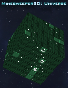
 Flush with the success of its recent movie adaptation, Minesweeper's star had never been higher in the eyes of the world. However, taking to heart the criticism that it's puzzle gameplay had gotten a little "flat" since the Windows 3.1 years, it began to seek a new dimension in its to hook the younger audience. One conference with foreign auteur Vjekoslav Krajacic later, and the result is Minesweeper 3D: Universe. Now with depth!
The rules of Minesweeper are probably burned in the mind of 95% of the target audience, but let's review for the Mac users and those that couldn't pull themselves away from Rodent's Revenge: The object of the game is locate all the mines on the board without activating any of them. Using the mouse, click various squares on the board. If the revealed square has a number (or, as here, a die symbol) beneath, it indicates how many of the adjacent squares (including diagonals) have mines under them. Clicking a square with no mines adjacent will automatically clear those around it. Clicking a mine will end the game. The [spacebar] toggles markers to be placed on a spaces where you believe a mine to be. Putting on totally sweet shades to celebrate victory is not required, but heartily recommended.
It's pretty hard to screw up a concept like "Minesweeper... IN SPAAAAAAAAAAACE!", and Minesweeper 3D: Universe doesn't disappoint. It has a nice mix of difficulties and rotating solids to play with, even if unlocking them all should come quicker. It would have been interesting to play rounds on some of the crazier topological surfaces: Tori, Mobius Strips... A Klein Bottle might be too much to ask for, but darned if it wouldn't be fun to sweep mines on it. Also, it was more difficult than expected to disregard the muscle memory that years of Windows gaming have made reflexive: righting-clicking for flags and the like. Still, those who enjoy Minesweeper in two dimensions will find it just as enjoyable a time-waster, and a very pretty one at that.


This is so epic. Really reminds me of the old minesweeping days, but the only one thing more difficult is that some folded areas in the 3D shapes doesn't make you know which square to choose, making you blow up half of the time on most of the harder levels.
But it was still really awesome.
The graphics were pretty neat and the music had a good feeling with everything else.
I was expecting to inspect the inside of the cube to find mines, but I was wrong.
Good game anyways.
Simply - AWESOME
This game is really fun and epic, I think the sequel to it should be themed food.
Intentionally didn't vote for this one. It's very well executed, but at the end of the day, it's, well, minesweeper.
Heck with this, make us a 3D Rodent's Revenge! You brought it up, now you have to do it!
And while we're at it... 3D Microsoft Bob? Anyone? No? Eh, probably for the best.
Enjoyed using the interface. Moving the cube around to check what was over the edge added [excuse the pun] an extra dimension.
One query: Say there is a mine in one of the corner cubes. Why can you only find it under one surface and not all three?
EG
Fabulous remake. 3D really becomes this game. Great handling and tough, immersive gameplay. Even the score is well-orchestrated - suspense and all - although the music-loop is too short (for a game that takes an average 10 minutes per round). Should've been a much longer score, but otherwise the game is immaculate. Mini-Juegos caught my attention long ago and they're still good. Notice how smooth and flawless the gameplay is - a result of exhaustive testing, no doubt.
@Earl Grey
The beauty of this game is that the definition of "surrounding square" in this game can be the same as in the classic game. This definition, how I define it, is this:
another square is surrounding "this" square if and only if that other square shares a corner point with this cell.
In the classic game the number of surrounding squares can be between 3 and 8, in this game it can be between 4 and 16. (I think, counter arguments welcome).
Its the best I can do with out drawing figures of 3d cubes.
try playing windows minesweeper after playing this
mind blowing
Meh. Not so great. I like the "flat" version better- the controls were easier. This color scheme makes the numbers hard to read. Why do they have to have symbols that blend into the background instead of plain and simple "1, 2, 3"?
I need to correct my self. The definition of "surrounding square" in this game can be the same as in the classic game. This definition, how I define it, is this:
another square is surrounding "this" square if that other square shares a corner point with this cell, excluding squares that are flipped upside down in orientation with respect to "this cell".
The X-wing fighter on medium level... frustrating!
@Philip
The defintion all depends on........whether you are digging on to a square or in to a cube.
The debate is:
The interface is 3D but is the game 3D?
[I think you can guess where MHO lies.]
Does it matter!
[Mmmmm... pedant city. The interface is great. I'm not sure how many people would mind. Funny things is, imagine how much more of a challenge the game would be if it was really 3D.]
great concept, thoroughly enjoyed it
Finished!
Update